Color Psychology for Interior Spaces | Design Guide
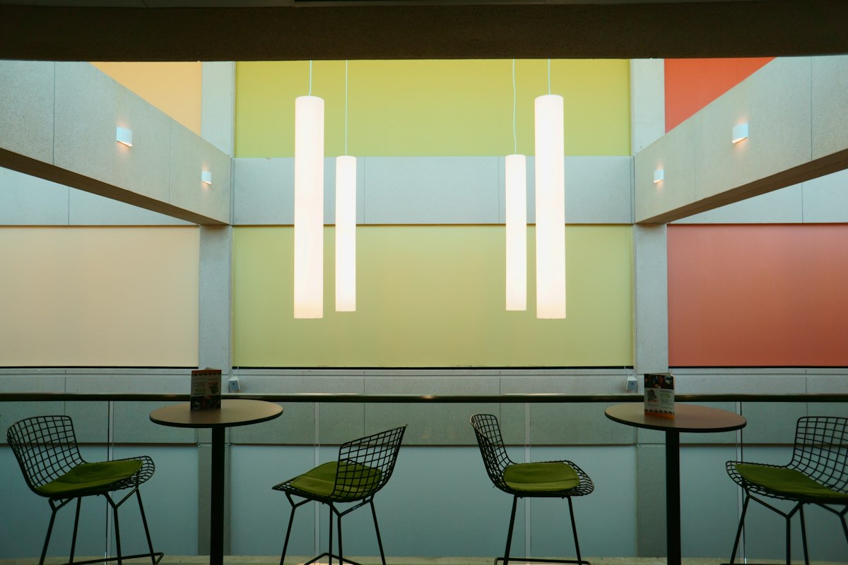
Color psychology for interior spaces is the study of how hue, saturation, and brightness shape the way a room feels — and how people behave once they are inside it. A single wall color can make a bedroom feel restorative, a living room feel social, or a listing photo feel instantly more inviting. Understanding these effects turns color from a purely decorative decision into a practical design tool for homeowners, designers, and sellers alike.
This guide explains how color psychology in interior design works in real rooms, which palettes suit which functions, and how to apply the same principles when staging a property for sale. For visual examples, browse our interior design ideas.
Key Takeaways
- Warm colors advance and feel intimate; cool colors recede and feel spacious; neutrals create flexibility.
- Saturation and brightness matter as much as hue — muted mid-tones are safest on large surfaces.
- Match color to room function: calm for bedrooms, connection for living rooms, focus for offices.
- Staging favors light neutrals with selective accents because they appeal to the widest buyer pool.
- Always test paint in the actual room under natural and artificial light before committing.
What Is Color Psychology in Interior Design?
Color psychology is the study of how colors influence mood, perception, and behavior. In an interior context, it examines why a soft sage green can lower the emotional temperature of a room while a saturated terracotta can raise it. The goal is not to assign a single universal meaning to each color — it is to understand the tendencies well enough to make deliberate choices.
Those tendencies operate through several channels at once: the emotional associations we absorb from culture and nature, the physiological response to light and contrast, and the way color changes our sense of a room's size, warmth, and cleanliness. A cool, low-saturation palette tends to read as calm and airy; a warm, high-saturation palette tends to read as lively and intimate.
Why Color Choices Matter Beyond Aesthetics
Color does functional work. It directs attention toward architectural features, disguises awkward proportions, and sets expectations about how a space should be used. A dining room painted in a deep, enveloping tone signals long dinners and conversation; the same room in bright white can feel more like a pass-through. Because color is the largest single surface in most rooms, it also has the biggest influence on perceived light and perceived square footage.
Context, Lighting, and Personal Preference
No color behaves identically in every room. The same blue can look crisp and coastal in a north-facing space with cool daylight and muddy and heavy in a warm, artificially lit interior. Personal history matters too — a color tied to a happy memory will feel different from one linked to a hospital corridor. Treat color psychology as a set of probabilities to design with, not a set of rules to obey.
How Warm, Cool, and Neutral Colors Affect a Room
The simplest and most reliable framework for the psychology of paint colors is temperature: warm, cool, or neutral.
Warm Colors Feel Inviting and Social
Reds, oranges, yellows, and warm-leaning pinks and browns advance visually, meaning they appear to move toward the viewer. That quality makes a room feel more intimate and enclosed. Warm tones are associated with energy, appetite, and sociability, which is why they work well in gathering spaces. Used at full saturation they can be stimulating to the point of restlessness, so warm palettes often work best when softened with earth tones or balanced by a cooler floor or ceiling.
Cool Colors Feel Calm and Spacious
Blues, greens, and cool violets recede, which makes walls feel further away and rooms feel larger. They are widely associated with rest, restoration, and focus. Cool colors are the default recommendation for bedrooms and quiet zones, but they can also read as clinical or chilly if the room lacks warm texture, wood, or layered lighting to soften them.
Neutral Colors Create Balance and Flexibility
A neutral interior color palette — whites, creams, greiges, taupes, soft grays, and warm beiges — provides a stable backdrop that lets furniture, art, and textiles carry the personality. Neutrals are the most adaptable choice for open-plan layouts and for any space that needs to appeal to a broad audience. The key is undertone: a neutral with a warm undertone will harmonize with wood and brass, while a cool undertone pairs better with stone, chrome, and glass.
Saturation and Brightness Shape Intensity
Hue is only part of the story. Saturation (how pure or grayed a color is) and brightness (how light or dark) determine whether a color whispers or shouts. A muted, mid-tone green feels grounding; the same green at maximum saturation feels playful and loud. Desaturated, mid-to-light tones are generally the safest for large surfaces, while saturated colors deliver more impact in smaller doses.
Best Colors by Room Function
Matching color to function is where theory becomes useful. Ask what the room needs to make people do, then choose the palette that supports it. For more room-specific guidance, see our wall color guide.
Quick Reference: Color Psychology by Room
| Room | Primary goal | Recommended palette | Use with caution |
|---|---|---|---|
| Bedroom | Rest and calm | Soft blues, muted greens, warm off-whites, gentle taupes | High-contrast darks and saturated reds |
| Living room | Connection and energy | Ochre, clay, olive, deep blue, warm neutrals | All-over intense saturation |
| Kitchen and dining | Appetite and sociability | Warm whites, soft yellows, sage, earthy reds | Cool grays that can feel clinical |
| Home office | Focus and low visual noise | Muted blue-greens, slate, soft gray-greens | Bright reds and oranges behind screens |
Bedrooms: Calming Paint Colors for Rest
Calming paint colors for a bedroom typically sit in the cool and neutral range: soft blues, muted greens, warm off-whites, and gentle taupes. These low-arousal tones support the transition to sleep and feel restful under low evening light. If you want more depth, choose a mid-tone rather than a dark saturated shade, and keep contrast low between walls, bedding, and trim.
Living Rooms: Energizing Colors for Connection
Energizing colors for a living room can be warmer and more expressive — ochre, clay, olive, or a confident deep blue. These tones encourage conversation and give the room a sense of occasion. A common approach is a warm neutral base with one saturated accent wall or a bold sofa, so the room feels lively without becoming overwhelming.
Kitchens and Dining Areas: Active, Social Tones
Kitchens and dining rooms benefit from colors that stimulate appetite and activity. Warm whites, soft yellows, sage, and earthy reds are classic choices. Because these rooms are often bright and busy, keep large surfaces relatively calm and let cabinetry, backsplash, or seating introduce the stronger hue.
Home Offices: Colors That Support Focus
For concentration, cool and green-based tones are the most dependable: muted blue-greens, slate, and soft gray-greens reduce visual noise and support sustained attention. Avoid highly saturated reds and oranges directly behind a screen, where they can feel agitating over long working sessions.
Color Psychology for Real Estate Staging
Color psychology in real estate staging has a different objective than personal design: the palette must help a property appeal to as many buyers as possible while photographing well. If you are preparing a listing, our virtual staging and interior design services can help you apply these principles at scale.
Appeal to the Widest Buyer Pool
Highly personal or trend-driven colors narrow your audience. Light neutrals, soft warm whites, and gentle greiges allow buyers to imagine their own furniture in the space rather than reacting to someone else's taste.
Make Rooms Feel Larger, Brighter, and Cleaner
Light, low-saturation colors reflect more light, which makes rooms feel more spacious and better maintained. Consistent wall and trim colors throughout a home also reduce visual interruptions, helping the floor plan read as more open.
Neutral Bases with Selective Accents
The most effective staging approach is a neutral foundation with a few deliberate accents — a muted blue in a bathroom, a soft green in a study, a warm textile in the living room. Accents add warmth and highlight architectural features without asking buyers to commit to a strong color.
How Lighting and Materials Change Color Perception
Color is not a fixed property of a painted wall; it is the result of light bouncing off a surface and into your eye. Change the light, and you change the color.
Natural and Artificial Light
North-facing rooms receive cool, indirect daylight that intensifies blue and gray undertones. South-facing rooms get warm, direct light that can make warm colors glow and cool colors turn yellow-green. Artificial lighting matters just as much: incandescent and warm LED bulbs push colors toward yellow, while cool-white LEDs flatten and chill them.
Flooring, Furniture, and Textiles
Large surfaces cast reflected color onto walls. Warm oak floors warm up a cool gray wall; a dark walnut floor can make the same wall feel heavier. Rugs, upholstery, and curtains all contribute, which is why a swatch that looks perfect in isolation can shift once the room is furnished.
Gloss, Texture, and Finish
Finish changes both mood and visibility. Matte and eggshell finishes absorb light and feel softer and more enveloping; satin and semi-gloss reflect light, appear brighter, and are easier to clean, making them practical for kitchens, bathrooms, and trim. Textured surfaces such as limewash or plaster add depth that flat paint cannot replicate.
Always Test in the Actual Room
Paint large samples directly onto the wall — at least two coats on a one-meter square — and observe them at different times of day and under both natural and artificial light. This single step prevents most color regrets.
Choosing a Color Palette for a Whole Home
A house feels considered when its colors relate to one another rather than competing room by room.
Build a Cohesive Palette Across Connected Spaces
In open-plan layouts, choose one base color for all adjoining walls and vary only the accents. In closed-plan homes, you can shift tone between rooms as long as the undertone family stays consistent.
Balance Bold Accents with Neutral Foundations
Roughly follow a simple ratio: the majority of surfaces in neutral or low-saturation tones, a secondary layer of mid-tone materials, and a small percentage of strong accent color. This keeps bold choices feeling intentional rather than chaotic.
Use Repetition to Create Flow
Repeat one or two colors from room to room — a green that appears in the hallway, then the kitchen cabinetry, then a bedroom textile. Repetition creates visual rhythm and makes a home feel larger and more connected.
Match the Palette to Lifestyle and Audience
A family home with young children benefits from forgiving mid-tones and washable finishes. A rental or listing benefits from broadly appealing neutrals. A personal residence can lean into stronger, more distinctive color. If you want to preview how different palettes change a room before committing, try AI room design to generate visual variations of your own space.
Common Mistakes to Avoid
- Choosing color based only on trends. Trend colors date quickly and may not suit your light or architecture. Use trends as inspiration for accents rather than for every wall.
- Ignoring room orientation and lighting. A color approved in a bright south-facing showroom can fall flat in a dim north-facing bedroom. Always evaluate in situ.
- Using overly saturated colors in small or low-light rooms. Strong, dark, saturated colors absorb light and can make compact or poorly lit rooms feel smaller and heavier. Reserve them for well-lit spaces or for smaller features.
- Overcomplicating the palette. Too many competing hues create visual noise and make a home harder to furnish. Limit yourself to a defined base, a secondary tone, and one or two accents.
FAQ
What is color psychology in interior design?
It is the study of how colors influence mood, behavior, and the overall feeling of an interior space.
Which colors are best for creating a calm bedroom?
Cool blues, soft greens, and light neutral tones are commonly used to create a restful and soothing atmosphere.
What colors help sell a home faster?
Neutral and light, widely appealing colors are often preferred in staging because they make spaces feel bright, clean, and adaptable.
Do warm colors make a room feel smaller?
Warm colors can feel more intimate and visually close, while cooler colors often make spaces feel more open and expansive.
How do I choose the right paint color for my space?
Start with the room's purpose, test colors in the actual lighting, and consider furniture, flooring, and the mood you want to create.
Next Steps
Color is one of the fastest, most affordable ways to change how a room feels — and getting it right starts with understanding the effect you want. If you would like to see how different palettes transform your own space before you pick up a paintbrush, Arch.AI's AI room design can visualize it in seconds. Try AI room design or browse more guidance on the interior design blog to keep learning.
From ideas to business use
Furniture retailers & interior studios
Compare a room photo, product references and an existing AI result. Check shape, colour and measurements before recommending products.
See the example and workflow →Tile showrooms
Discuss flooring choices using a visual concept. Use physical samples and room measurements for the final decision.
See the example and workflow →Property agents & developers
Explore staging ideas for listings. Show the original photo and disclose the AI concept.
See the example and workflow →Ready to design your space?
Try AI-powered room design and transform your photo into a beautifully staged room in seconds.
Try It Now